01 / The question
What holds different
kinds of work together?
A developer toolkit, an interactive field station, a film library, and a mobile guide don’t explain a studio by themselves. Each has its own audience and its own character. The company site needed to help a visitor understand the point of view behind them without flattening those differences.
I wanted a clear introduction: what Orca makes, what someone can inspect, and how to start a conversation. The personal site has room for the wider life behind the work. Orca gives the software practice a focused home, with my name and responsibility visible.
02 / The decisions
One clear promise.
Room for the evidence.
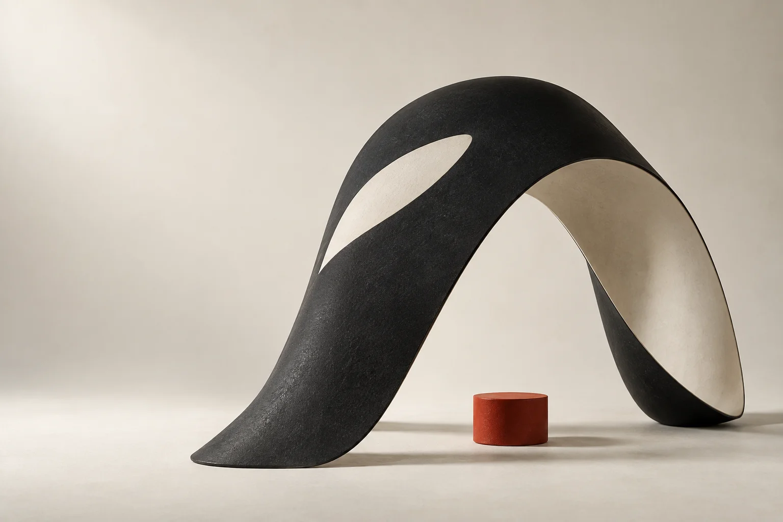
“Make the moving parts make sense” became the organizing idea. It connects the studio’s work through a useful outcome: making a complicated system easier to understand and act on. The opening pairs that promise with a sculptural image, giving an abstract idea a physical form.
The project index keeps the first pass brief. Each entry opens into more detail, so a visitor can choose where to spend time. Release labels stay beside the projects: a release candidate, a planned demo, a proof of concept, and a product in development are different kinds of evidence.
The studio passage names the owner of the work. The invitation asks for the situation someone is facing, leaving room for a conversation before there is a specification.
03 / The identity
A company voice.
A recognizable signature.
The Signal mark, strong sans-serif typography, warm light canvas, and vermilion accent give Orca a consistent visual language. The black-and-ivory sculpture adds scale and texture; the compact identity has a different job, remaining useful in the header and at small sizes.
I directed the work with AI design collaborators, developing the identity and website as related parts of the same project. The final choices stay coherent across the mark, imagery, hierarchy, and copy. Product identities remain recognizable within their own project material.
Alongside this personal site, the contrast is deliberate. Orca leads with a studio promise. Here, the introduction starts with a person. Both have a clear owner, and each has space to speak in its own voice.
04 / The build
A simple site,
carried through carefully.
The implementation uses static HTML and CSS, a small Node build, and optimized local artwork. Native project disclosures let visitors inspect details without turning the page into a separate application. Navigation, project links, and contact remain ordinary browser interactions.
The responsive layout carries the same hierarchy from a wide screen to a phone. Visible keyboard focus, descriptive image alternatives, and reduced-motion handling are part of that implementation. The work is in the details: readable status labels, useful destinations, and a direct route to email.
05 / Where it stands
A working front door.
The company website is published on GitHub Pages. Visitors can explore the current project index, read the studio’s introduction, and contact me directly. The live page is the result to inspect; this case study explains the decisions behind it.
The website’s launch doesn’t change the release state of the products it presents. Those labels and destinations will continue to evolve with the work. The structure gives them a consistent place to do that.
 Jason Fricano